

2002
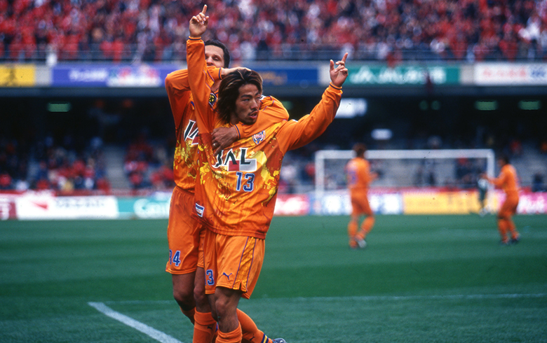
The year the World Cup took place in Japan saw Alex, Morioka, Ichikawa, Toda and their teammates win a new Japanese Super Cup, a few months before the four stars of S-Pulse played for their country, in front of the world they usually wear on their club shirt. The season in itself hasn't been as good, with no other cup to add to the trophy room, and the team finishing eight of the league, even with the help of Korean super striker Ahn Jung-Hwan.
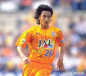
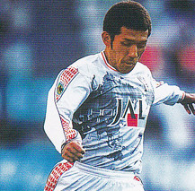
Even if the camo uniforms served the team well for three seasons, it was time for a change. New uniforms were made by Puma, following the thread of modern, breathable and non-shiny material. The world map is highlighted as it takes the whole front of the shirt, as it was the case in 1992. A gradient background, countries' names and multiple rays of light added some style to a unique design that will be qualified as the "most beautiful shirt ever" on several websites around the world. Five rows of yellow arrows, bordered with two blue lines, were placed along the shorts and on the sleeves. The away uniform still was a white version of the main kit, and looked just as great. The Emperor's Cup Champions badge replaced the classic J.League badge on the sleeve, while Honen left the place to another J-Oil Mills brand on the other sleeve. For the first time, the player's name is shown on the shirt as a standard, under the back number. It would become usual afterwards.
Honours :
-Japanese Super Cup : 2002. 
Brand : ![]()
Sponsors :
Front : ![]() / Back :
/ Back : ![]() / Sleeve :
/ Sleeve : ![]() / Shorts : None.
/ Shorts : None.
Badges : ![]()
Numbers / Nameset :


Jock tag : ![]()
Template used : None.
Counterfeit : No.
Differences between authentic and replica : Once again, the only difference was the jock tag : "Professional" for the retail versions of the shirt, "Pro Use" for the versions made to be used by the players.

TRIVIA
-The arrow legacy : From the mid-90's to the early 2000's, Puma integrated an arrow pattern in every Shimizu S-Pulse uniform it designed. On the 2002 version, the arrow pattern is placed all along the sleeves and the shorts' sides. It is the last design to include the arrow pattern, ten years after the first one.
-Common fabric : Even if the design was unique, the new fabric was also used by other teams under contract with Puma, such as Oita Trinita or Jubilo Iwata.
-English letters : The font used for the players' names on the back looked a lot like the font that was used in the English Premier League at that time.