


2021
After a difficult 2020 season which Shimizu ended at the 15th rank, many players where replaced. The club welcomed several new key players such as Disaro', Thiago Santana, Shuichi Gonda and a new coach : Miguel Angel Lotina. The staff also kept essential players such as Renato Augusto and Kenta Nishizawa. After a first 3-1 away victory at Kashima, the club and supporters had high hopes for this new season.
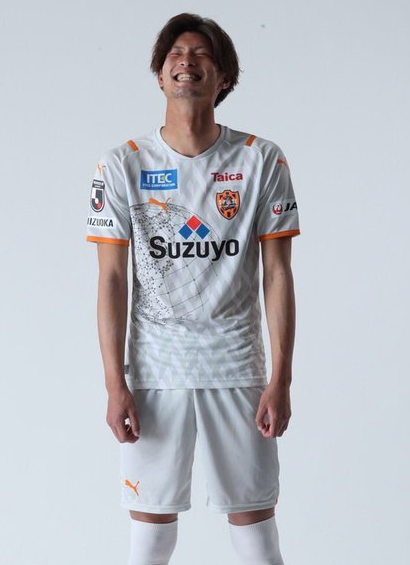
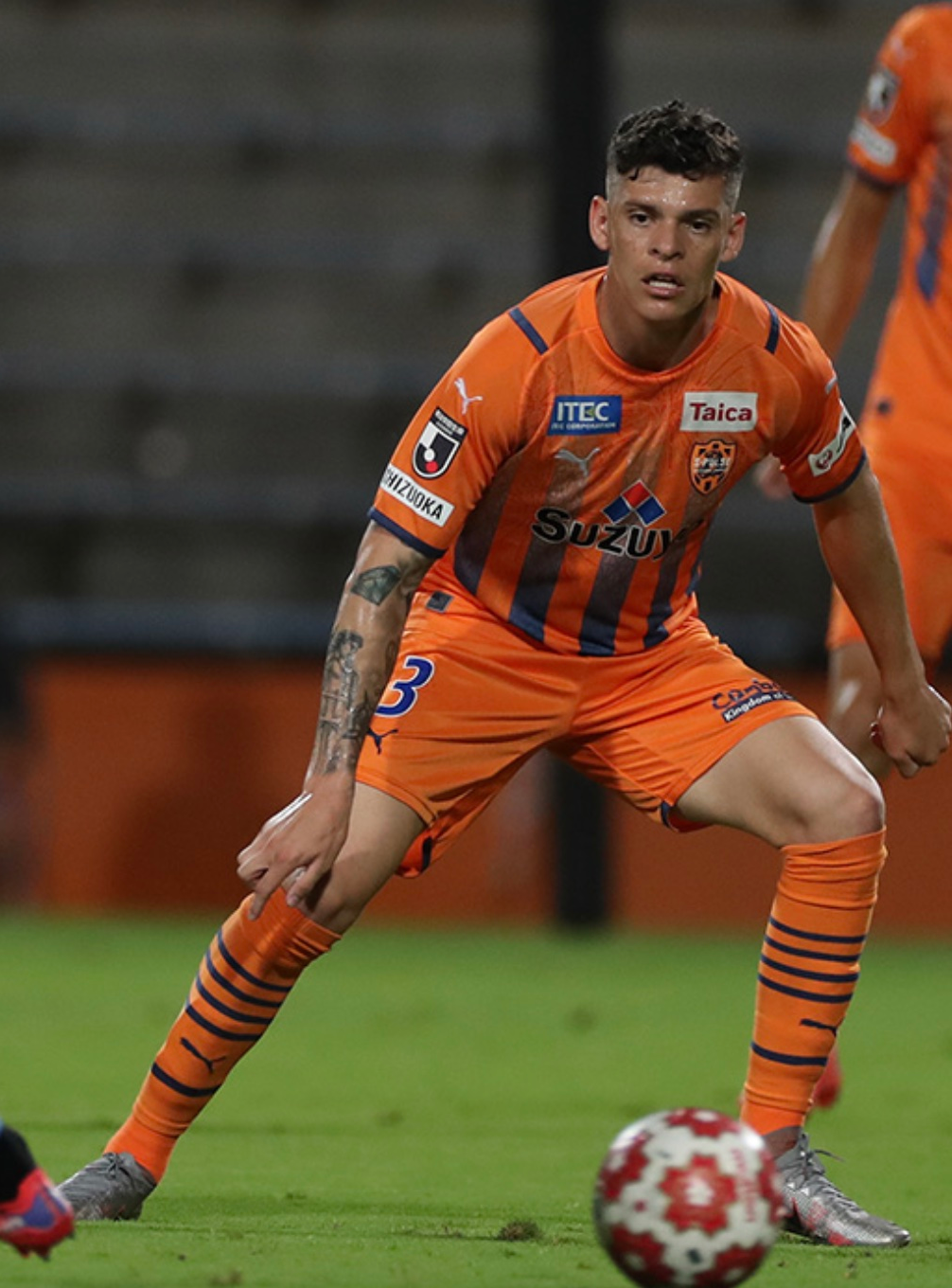
The 2021 uniforms are kind of an evolution from the 2020 set. The home color is obviously orange, while the gray color used in 2020 for the away games was kept once more. The globe was redesigned in dots and straight lines and placed on the front of both uniforms, in white on the home kit and in dark gray on the away kit. The same pattern is used as a background on both uniforms, composed of big arrows mixing shades of orange or gray, depending of the kit. It renders a false 3D perspective. The numbers are blue on the home uniform and black on the away one, which gives the latest a 2006 vibe.
A summer shirt was once more released during the season. Sharing a similar aspect with the 2019 summer shirt, it is composed of blue stripes made of scaffoldings, orange fireworks and a little text on the bottom right, saying "WITH RESPECT FOR MINATO MATSURI". The whole shirt is obviously a nod to the Minato Matsuri festival, which occurs on Shimizu port.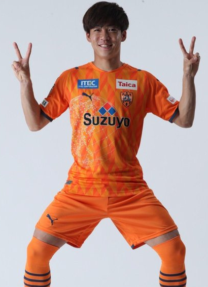
Honours : None.
Brand : ![]()
Sponsors :
Front : ![]() +
+ ![]() +
+ ![]() +
+ ![]() / Back :
/ Back : ![]() +
+ ![]() / Sleeve :
/ Sleeve : ![]() / Shorts :
/ Shorts : ![]()
Badges : ![]() +
+ ![]()
Numbers / Nameset :


Jock tag : ![]()
Template used : Puma Ultimate.
Counterfeit : Yes. The home shirt, away shirt and GK shirt were counterfeited, the design, the cut and the fabric were wrong compared to the original ones.
Differences between authentic and replica : None.

TRIVIA
-Common typeface : For the first time in the J.League history, all the clubs struggling in the championships had to use one unique typeface on their uniforms. This was already common in several championships around the world.
-Black is the new orange : Since the J.League clubs were forced to use the new J.League typeface for the names and numbers put on the uniforms, only a few colors were made available, and orange wasn't one of them. S-Pulse first planned to use blue on both uniforms but finally decided to use black on the away kit instead of blue.
-The arrow legacy : Once again, the pattern used on the all of the shirts looks a lot like the arrows that were regularly used on the club's uniforms in the 90's and in the early 2000's.